Avalon Exchange
Effortless Style, Seamless Experience.
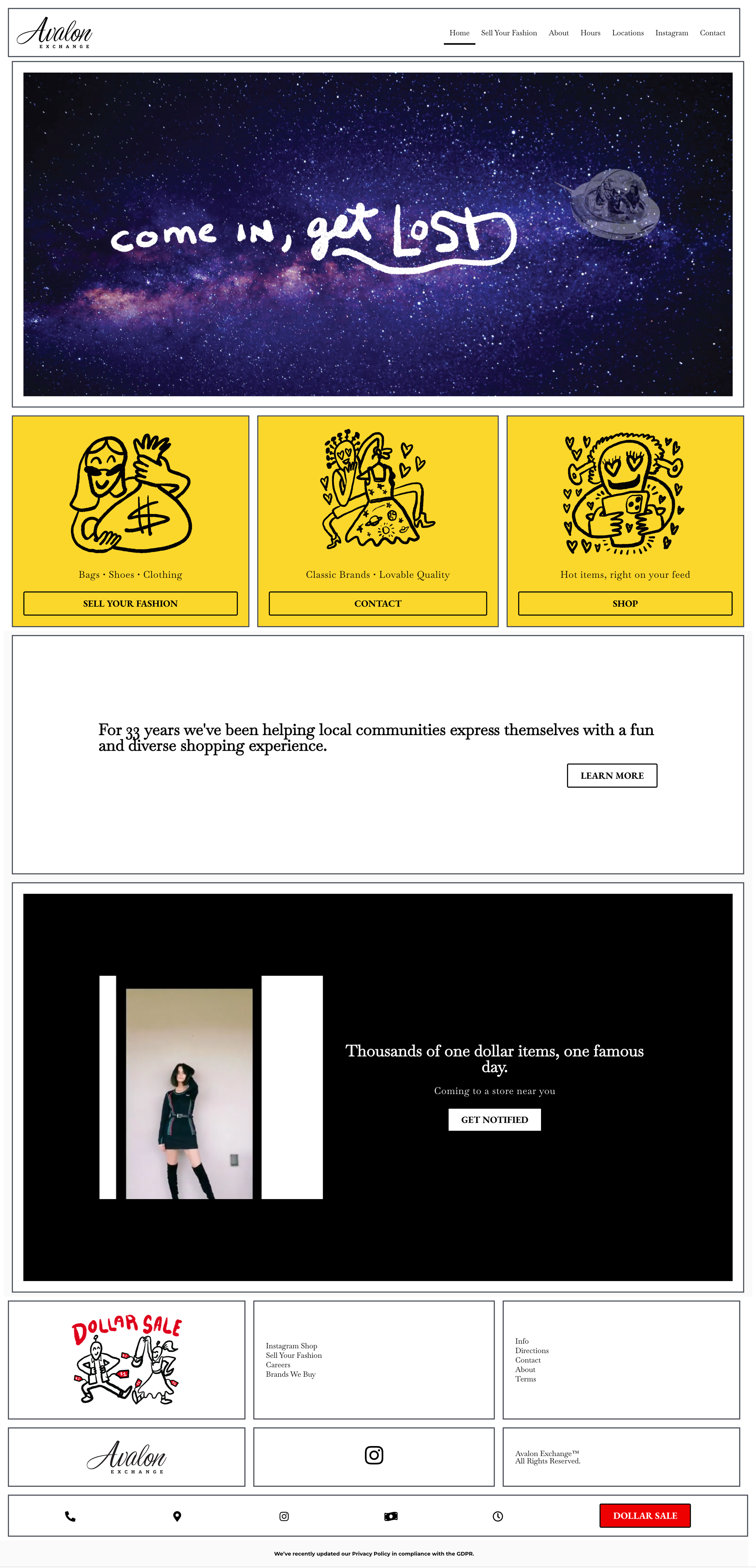
Overview: In today’s world, a successful online presence plays a prominent role in helping the business stand out among competitors. Avalon Exchange, a beloved local second-hand fashion shop, seems to be falling behind in building an intuitive online shop.
This project dives into the heart of user experience, crafting a dynamic and intuitive website information architecture for Avalon Exchange. By completely optimizing the way shoppers interact with the website, we help Avalon Exchange connect the best pre-loved fashion to its excited treasure-hunting customers.
Duration: 10 weeks
Role: UX Designer, UX Writer
Tag
Information Architecture
UX Design
Site Map Design
User Research
UX Writing
Keyword
eCommerce
Second-hand Fashion Shop
Problem Statement
The lack of effective information architecture of the Avalon Exchange website is severely discouraging second-hand fashion shoppers from enjoying their online treasure hunting. Both the business and the customers would largely benefit from a redesigned Avalon Exchange website that is user-friendly, intuitive and supportive.
Research
Observation
In-store Interview
Research Methods
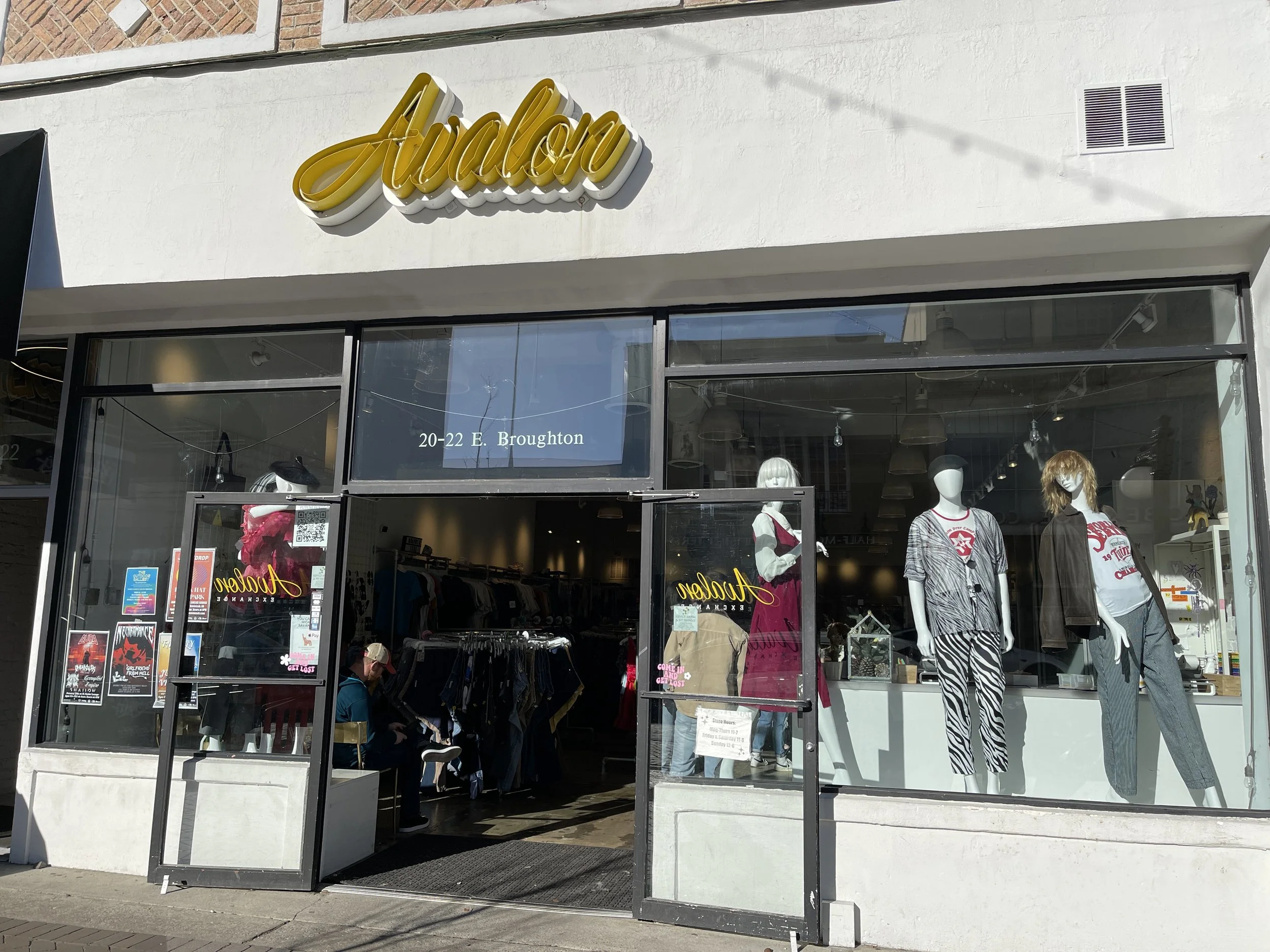
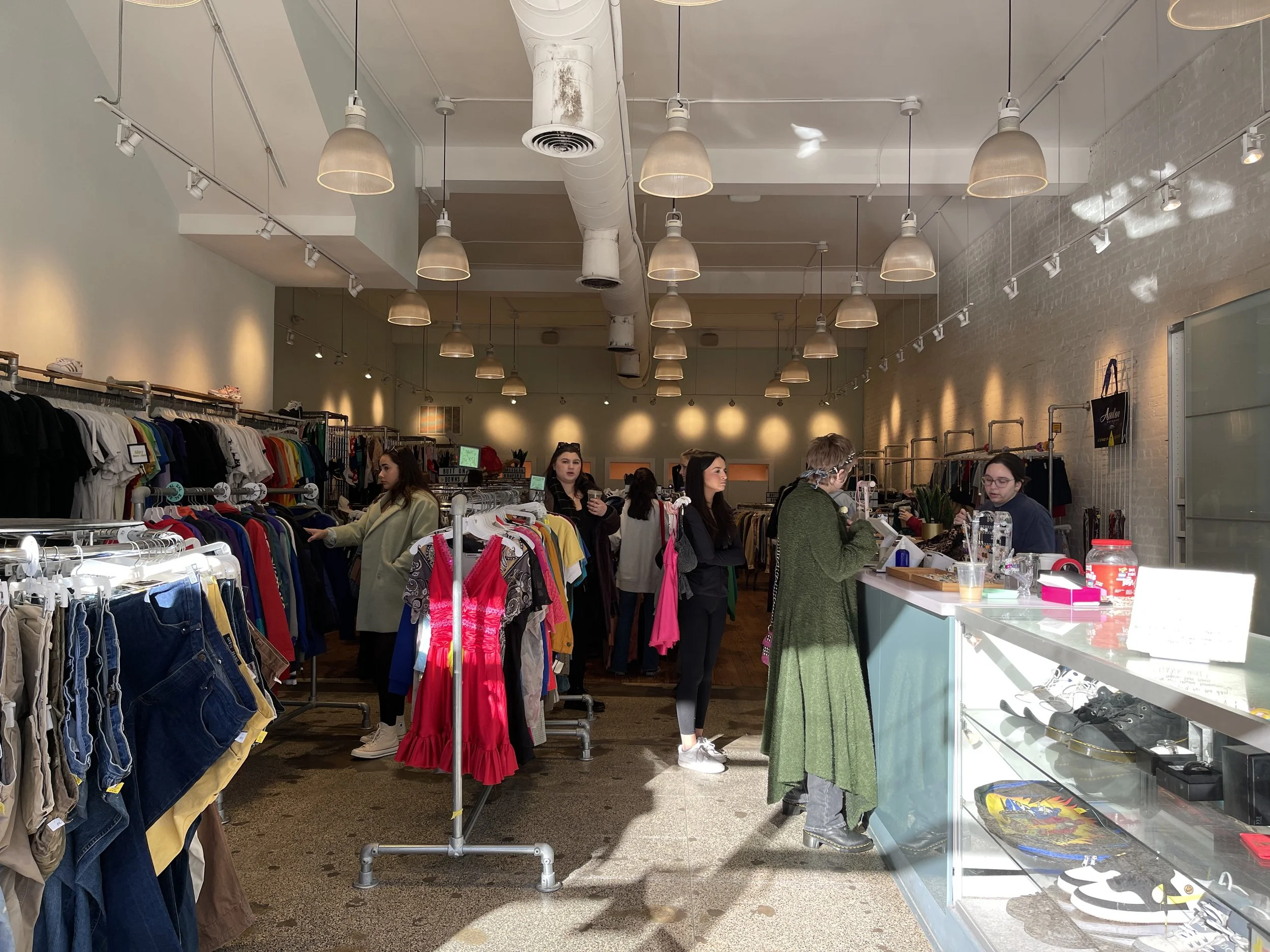
We utilized observation and interviews as our main methods of user research. In the Avalon Exchange store in Savannah GA, we observed the movement, browsing process, trying behavior, and purchase actions of customers in the store environment. We also conducted interviews with 3 randomly chosen customers with different levels of experience and knowledge in buying/ selling second-hand fashion.
Research Insights
People are aware of the environmental benefits of second-hand fashion trading, and they are willing to do it when it can be easily conducted
Buyers like personal and cheerful shopping experiences in welcoming atmosphere
Buyers appreciate a wide range of options
Buyers value fashionable and passionate staff
Sellers wish for an easy selling procedure
Good organization and sorting of the items make shopping easy
Uniqueness means a lot
Buyers like to make friends in the second-hand fashion community
Current Website Analysis
Problem Analysis
Unnecessary links in the header
Repeated links across the page
Link descriptions lack clarity or are not directly related to link content
Images and headlines lack meaningful indication of website function and brand purpose
Floating bar provides repeating information and links
Blocks lack proper sizing, causing extra scrolling of the webpage.
Current Site Map
Proposed Website Design
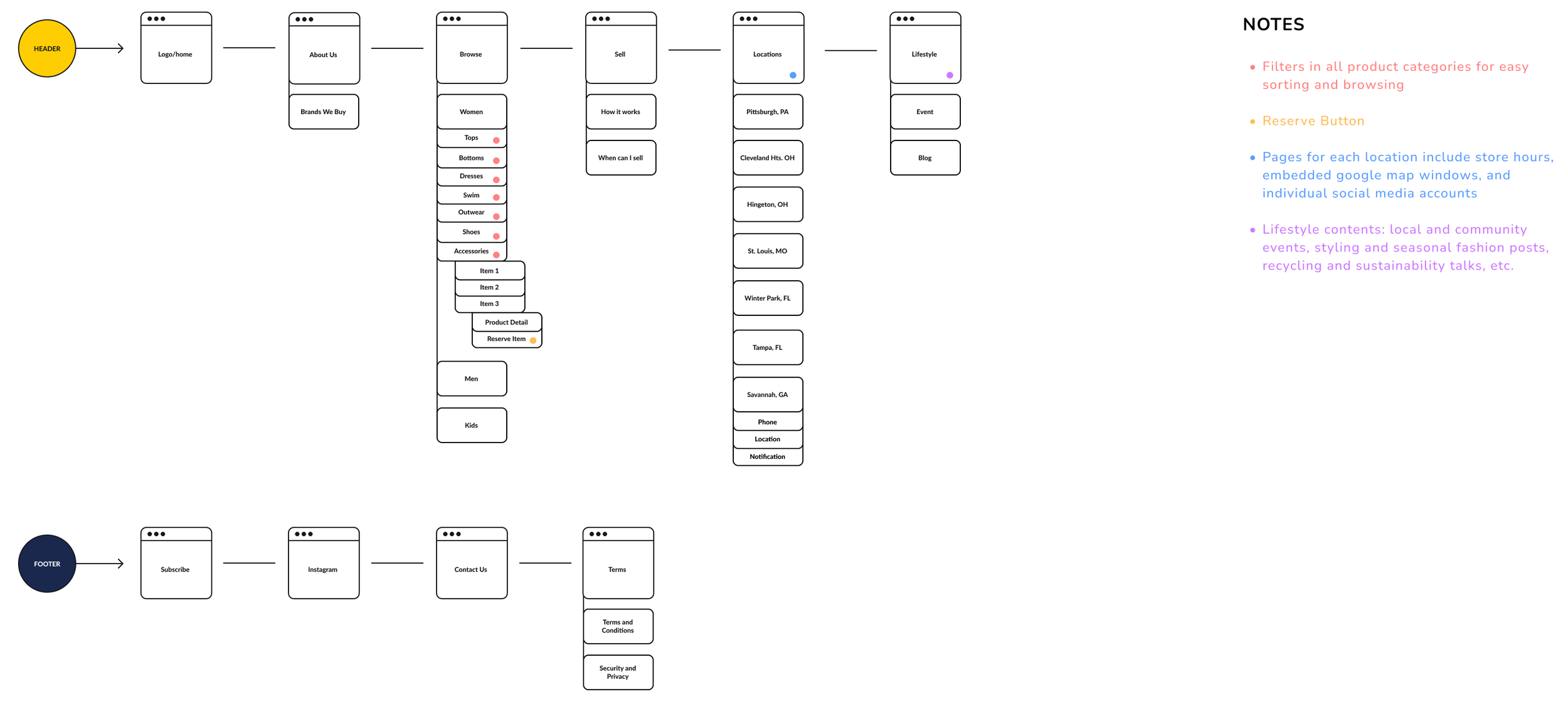
Recommended Site Map
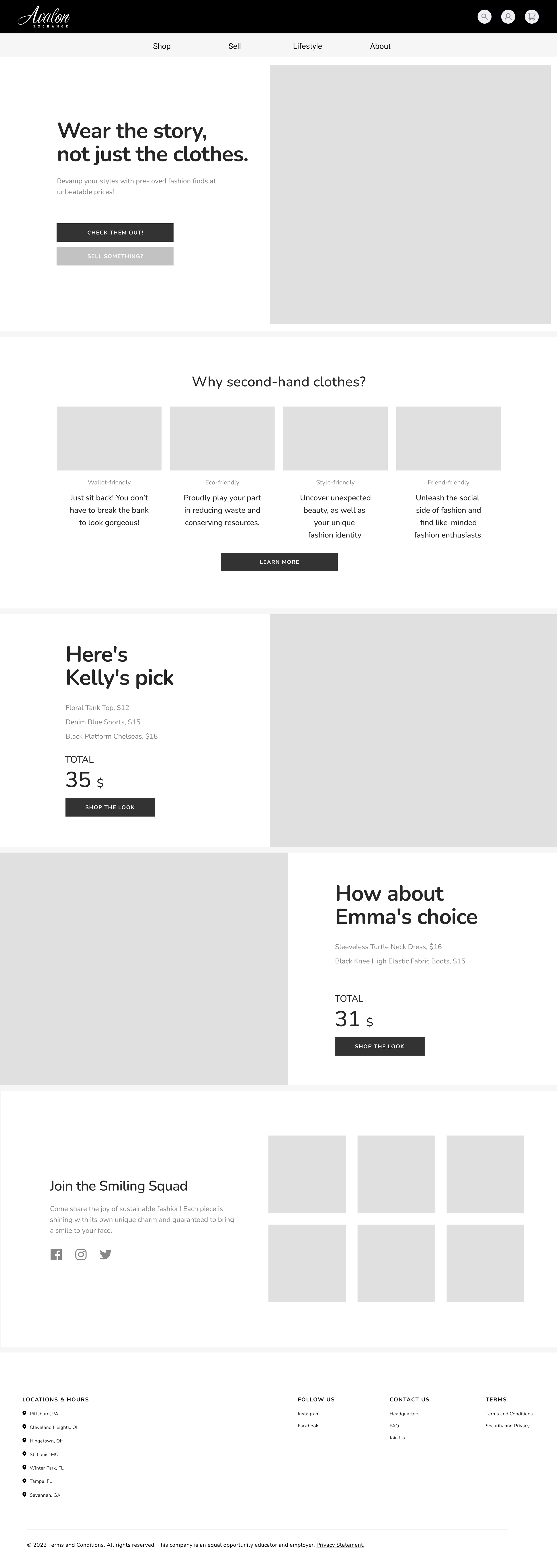
Proposed Wireframe
Header
Simplified navigation bar
Search, Customer Registration and Shopping Cart features added for convenience
Homepage
Brand purpose explained
Highlighted featured products with prices
Item categories for faster sorting
Outfit showcase for community building
Footer
Google map link to every store
Ways of connecting and interacting
Product Page
Options for delivery methods
Collapsable tabs for different types of product information
Model measurement as reference
Virtual try-on feature
“Save the look” for easier further shopping and matching
Product A/B Testing
We printed and presented two distinctive prototypes for the newly designed product pages, one safely traditional and one boldly creative, to users for evaluation and feedback.
Through this hands-on approach, we aimed to strike an equilibrium between functionality, layout, and user preference, ultimately refining the information architecture to create an engaging and seamless shopping experience.

